We’ll find the type.
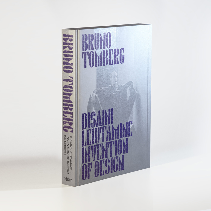
This typography system communicates biographical reverence through material nostalgia—the custom Bruno 100 carries geometric modernist DNA filtered through craft memory, while its fuzzy texture treatment suggests the patina of time and tactile engagement. The pairing creates scholarly intimacy, balancing archival authority with the warm imperfection of handmade processes, perfectly embodying the intersection of Estonian design history and contemporary museum scholarship.
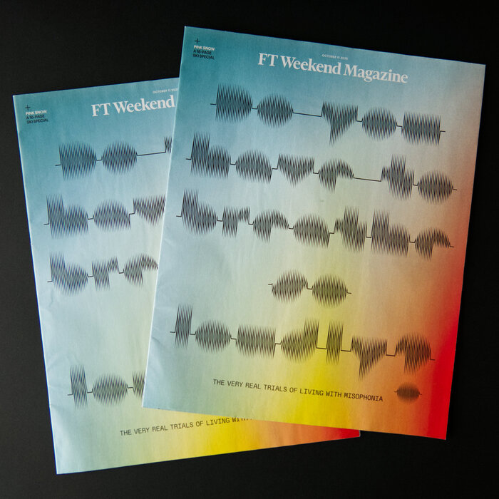
This typography system creates clinical empathy through conceptual precision—the visual manifestation of sound disturbance itself becomes the communicative tool. Sonic Waves' waveform-derived letterforms carry genuine scientific authenticity while maintaining editorial sophistication, transforming a medical condition into accessible visual narrative. The pairing creates intellectual intimacy rather than sensational drama, letting readers approach a sensitive topic through typographic metaphor.
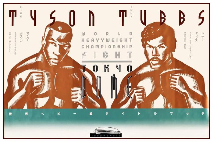
This typography system channels industrial-futurist spectacle through aggressive geometric construction and monumental weight distribution. The custom fonts embody heavyweight authority via ultra-bold proportions and architectural solidity, while their geometric form model creates technological precision that transforms boxing into a space-age spectacle. The bilingual execution demonstrates how rational geometry can transcend cultural boundaries while maintaining brutal impact.
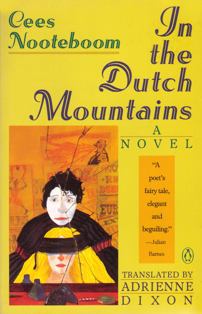
Adastra's inclined inline construction with swash capitals creates a theatrical, old-world literary elegance that perfectly captures the fantastical yet melancholic spirit of Nooteboom's nested narrative. The dynamic form model—with its open apertures and diagonal stress—combined with the decorative inline treatment suggests both the whimsy of circus illusionists and the gravitas of European literary tradition, bridging entertainment and high culture in a way that mirrors the novel's story-within-a-story structure.